


COLOUR AND NARRATIVE
- Taylor Joe Berger

- Apr 4, 2022
- 7 min read
Updated: Apr 18, 2022

(Still, Lykke Li in "Hard Rain", 2018)
As Lykke Li is preparing to launch her next project EYEYE, which definitely will include its very own interesting visuals, or rather "loop installations" as she teased in her very recent Vogue interview, I take this opportunity to look back at a previous essay on colour as a dramaturgical instrument in film, by example of the music video for Hard Rain directed by Anton Tammi.
The human eye has the capacity to recognize and tell apart over a million different colours, yet language has failed to capture more than a handful in comparison. In film one was so desperate to include colour from the start of its creation, that there were numerous filmmakers around 1895 and 1950 that hand-coloured each individual frame, as seen in the famous example by the Lumière Brothers and their Serpentine Dance from 1899. There was also a technique called 'tinting' which would allow filmmakers to tint the entire roll of film or larger sections of it in a colour of their choosing to deliberately shift or exaggerate the narrative of their stories.
With digital film a new world of opportunity opened for us as filmmakers and consumers. Every hue, luminance and saturation became available to us.
Directors like the Lumière Brothers were or Wes Anderson is fully aware of the fact that colour always produces a psychological reaction in us viewers. Historically we have gained a knowledge of different associations to colour which, depending on the cultural background can vary – the sentimental knowledge however seems to be fairly accurate throughout all human beings.
Red for instance is globally associated with fire and blood. Therefore, being a symbol of warmth, passion and love but also aggression and destruction. These associations can be a striking tool to further elevate or shape the narrative of a film.
Another great aspect or talent of colour and colour schemes is, that when used correctly, it results in cohesiveness. This is something we all could witness with the release of Lykke Li's latest full length album called So Sad So Sexy (2018). All three of the so far released music videos share a very similar colour scheme. This analysis deals with how the colours have been utilised in Lykke Li's new releases, especially in the video for Hard Rain.
What we have established before is that certain colours are chosen to be read and understood in certain ways. However, these previously mentioned associations are not to be read as a clear set of rules to follow. It is less important to think of these colours as fixed expressions synonymous to certain adjectives but nonetheless important to pay attention to them, in order to find their specific place and meaning in a film. There have been decisions made on why and where which colour appears. This is reason enough for us as viewers to stay alert and find the subjects connected to the colours. Whether they are actual protagonists which keep and hold a certain colour, or perhaps a feeling which is visually expressed through colour.
Hard Rain
Hard Rain has many visually compelling tools. What I find impressive about the project So Sad So Sexy is the cohesiveness in the sound and look of the album. The colours in all three of the in the following order released music videos: "Utopia", "Deep End" and Hard Rain, are reoccurring in every single one. In the case of "Deep End" there were even previews of certain settings and locations for Hard Rain. These seemingly small details connect all three videos beautifully, without it feeling forced or contrived.
What Hard Rain works with in particular, is the complementary colour scheme. Where two colours which are in direct opposition to their counterpart are used according to the complementary scale. None of the pairs within complementary colours dominate the other. If mixed they would end up being a light to dark grey. They cancel each other out so to speak.
By taking these opposites we already have a platform for narrative. We know these are two polar opposites, we know that none is stronger than the other. Naturally when Lykke Li is placed in the middle, in between two colours, we expect a border- or the fading of.

(Still, Lykke Li, "Hard Rain", 2018)
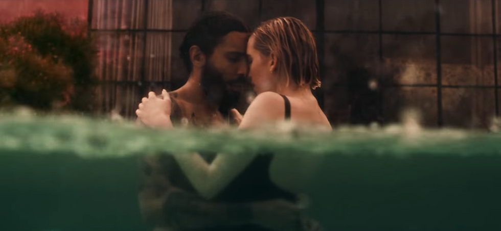
The video starts out with Lykke Li and her lover kissing in the shower, a clear shower curtain between them, keeping them mechanically and synthetically apart. There is a strong red light projected onto her back, whereas her lover on the other side of the curtain is lit in green. Red and green are complementary to each other. Therefore, the border between the two is hereby the shower curtain. We know that these colours are vibrant on their own, but fail to mix and blend to produce another vibrant colour. So, there is a sense of danger which feeds into the Idea of both of them (Li in red and lover in green) touching or engaging with one another, as this may result in them losing themselves without gaining a new. Before we move onto the next shot, which is the title screen of the video for Hard Rain, also completely drenched in red, we witness the lover`s hand slide under the curtain and hold onto Li's shoulder blade. A trespassing, musically underlined like we are used to in horror films. The story has begun.
Her lover now walks down a hall which again is lit in red. He is now moving freely in her space. Lykke Li in her red jumper moves in the opposite direction. The red getting paler with each step, halting in a still vibrant pink.
We see pond lilies from above, a pair of frogs crawling on them. Both in a similar direction, sharing the pool like Lykke Li and her lover. Here we see again the red and green imagery. Above water is red whereas everything beneath the waterline is green. And again, as a result to these opposites we have a clear accentuated border (here the waterline) cutting the image in half.
(Still, Lykke Li, "Hard Rain", 2018)
Still in the theme of water the pair now arrives at an aquarium rack of a pet store. A sad trend in the pet-industry is to manipulate the lighting of fish tanks in order to let mainly tropical freshwater fish appear in a more toxic vibrant neon colour scheme, similar to the flashy colours of reef fish, rather than showing their natural colouration. This 'fake' light is flooding the entire room. Tinting the couple in their seemingly happy relaxed state. We see Lykke Li back in the pool alone, in a bright red dress creating gorgeous lavish shapes, followed by a 'match cut' the image of a red betta fish and its flowy fins appears, mimicking the dress we have just seen. Aligning these two images to one another, let's us overlap Li's and the fish's experience in an elegant and obvious way. Her lover bought her the fish, confined in a plastic bag. This could be read as an omen to where the couple is heading in the storyline – feeling trapped?
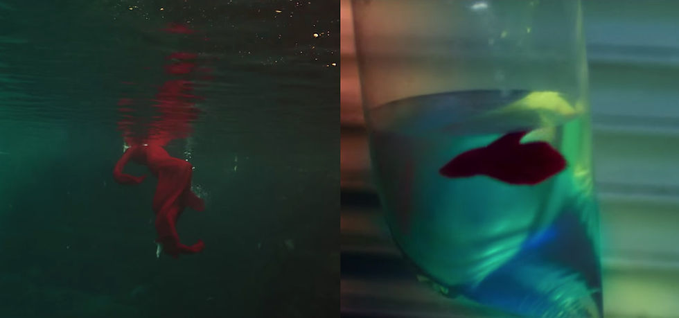
(Stills, left Lykke Li in "Hard Rain", right betta fish in "Hard Rain", 2018)
After clinical and playful neon lights and a quick flickering of images, one of which is the couple sharing a bed, the covers being green while bed sheets and pillows are dark red, we arrive in the heart and seemingly most authentic raw part of the video. A short break, natural lighting, a sunset in the background, the couple`s touching foreheads, mimicking each other's movements. What potentially could have been an awkward moment in a music video is a refreshing and genuine halt within the story, lovers being oblivious to the rest of the world, only perceiving each other.

(Still, Lykke Li in "Hard Rain", 2018)
This lyric is very well applicable to the usage of the complementary colour scheme within the video. It focuses on the opposites between the two, sharing the same space yet always divided, whether it be through a curtain, waterline or just a naturally occurring border where one colour ends and the other starts. It also of course is the heart of the song itself and where the couple is heading towards in their relationship.
From here on the gap or wall between the couple seems to manifest itself in growing impatience and frustration in Lykke Li. The colours mainly remain red and green or shift to orange and blue, which again are complementary. What is interesting when looking at the following image, is the compositional aspect in addition to the colours. Whereas the blue on Lykke Li's side claims more space than the orange, her lover does the same by occupying more space in the frame than her. The colours alone seem unbalanced but once we add the associated bodies, the frame appears perfectly balanced.

(Still, Lykke Li, "Hard Rain", 2018)
We arrive at an image reminiscent of the opening scene. Lykke Li and her lover interact through a physical and transparent separation. Contrary to the opening scene this divider is not flexible, nor is it as clear for her to see through as the shower curtain. It appears decisions have been made on her side which have set, like the glass dividing the two. She no longer interacts or even looks at her former love interest, who is still trying to reach out through the sheer wall.

(Still, Lykke Li, "Hard Rain", 2018)
Interestingly we see three dominant colours this time around. Lykke Li occupying the left corner in her red jumper, stands near green whilst her lover on the other side of the barrier occupies the larger portion of the image in a pale peachy orange. Is the addition of a third colour introducing something new to the story? A dynamic implementing where the story is headed, or simply suggesting that the conflict might be resolved here? Lykke Li leaving him in this orange space while she follows the green space, maybe for someone else to fill? Or is the green space on the left merely signalling her escape route? As she follows the same tension between red (Lykke Li) and green, as she formerly did with her now shut out lover?
Whichever way we choose to interpret these colours, there is an underlying theme and association with our subjects throughout the video which is undeniable. Let us choose to see these colours and try to use language to expand on what we perceive as narrative. Colours can be a very reliable, unassuming and elegant way to further transport a story, as well as generate a sense of cohesiveness throughout a project, which relies on colour schemes, as a kind of by-product.
Follow this link for more behind the scenes photographs and info on the making of the video.

Comments